The Edit / Colour & Dye
Why Your Saree Colour Looks Different in Person
It is rarely a seller lying. It is metamerism, dye lots, and the gap between what a screen can display and what a dye can physically do.
Written & reviewed by the Aroha Radiance editor
Published Aug 4, 2026 · 8 min read
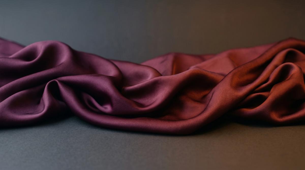
You ordered a deep wine saree. What arrived reads closer to brick. You compare it against the product photograph on your phone, and the photograph still looks wine. Nothing has changed on the screen and nothing has changed in the box, and yet they do not match.
This is one of the most common frustrations in online fashion, and it is also one of the most misunderstood. The default assumption is that the seller misrepresented the product. Sometimes that is true. Far more often, several well-documented physical phenomena are operating at once, none of which involve anybody being dishonest. Understanding them will not make the problem disappear, but it will tell you which cases are worth disputing and which were never avoidable.
Screens and dyes are not the same colour system
This is the foundational issue, and it is not a matter of settings.
A screen is an additive colour system. It emits light, mixing red, green and blue to produce colour, and combining all three at full strength produces white. Fabric dye is a subtractive system. It absorbs light and reflects what is left, with cyan, magenta and yellow as the primaries, and combining them moves toward black.
These two systems do not have identical reachable ranges, and the gap is not small. Colour-management practitioners in textile production consistently report that screens can display meaningfully more colours than standard textile dyes can physically reproduce the display gamut simply extends beyond what dye chemistry can reach.
The implication is uncomfortable and worth stating plainly. Some of the colours you have seen on product pages do not exist as achievable fabric. The photograph is not lying about what the camera captured; the dye simply cannot get there. This is most acute in highly saturated jewel tones — vivid emeralds, electric blues, intense fuchsias which is unfortunately much of the Indian occasionwear palette.
Your screen is probably making it worse
Most consumer displays ship in a mode designed to make photographs and video look appealing rather than accurate. These modes push blue, boost contrast and oversaturate. Phone screens are the most aggressive offenders, and a phone is where most people shop.
Professional colour evaluation does not happen this way. It happens against calibrated displays and, for physical samples, under standardised lighting. The industry reference is a D65 illuminant a daylight-simulating source at approximately 6500K precisely so that everyone assessing a colour is assessing it under the same conditions.
You are not going to calibrate a monitor to buy a saree, and nobody should suggest you do. But it is worth knowing that the image you are judging has passed through the seller's camera, the seller's lighting, the seller's editing, and finally your uncalibrated screen in whatever ambient light you happen to be sitting in. Four transformations, each with drift.
Metamerism: the one that ruins coordinated outfits
Metamerism is the phenomenon where two fabrics appear to match under one light source and visibly differ under another. It happens because the two fabrics achieve their apparent colour through different dye combinations, which reflect and absorb different parts of the spectrum.
Different light sources emit very different spectra. Daylight contains the full visible range fairly evenly. Incandescent bulbs are heavy at the warm end and weak at the cool end. Fluorescent and LED sources have their own distinctive, often spiky distributions. A fabric pairing tuned to match under one spectrum has no obligation to match under another.
In textile production, metamerism is more common when two samples are made using genuinely different dyes or pigments than when they differ merely in dye concentration. This is why it bites hardest in exactly the situation Indian occasionwear creates constantly: a blouse stitched from one fabric, matched to a saree in another, possibly with a dupatta in a third, each dyed separately.
It is also why a match made in a shop under retail lighting can fail in a wedding hall, and why an outfit assembled indoors can separate visibly the moment you step outside for photographs. Manufacturers manage this with standardised light booths that let them view samples under several illuminants before approving a colour. You do not have a light booth. You do have windows and a phone torch, and checking a match under both daylight and indoor light before committing is a reasonable approximation.
Dye lots and why the photograph is not your saree
Textile dyeing happens in batches. Large machines process substantial quantities of fabric at once, and even small fluctuations water temperature, dye concentration, fabric tension, timing shift the resulting shade.
The professional threshold for acceptable variation is a Delta E of 2.0 or less, meaning the numerically measured colour difference between batches stays below the point where most observers would notice it side by side. That is a manufacturing standard applied under measurement. It is not a promise that the specific length of fabric photographed for a listing came from the same dye lot as the length that was cut for your order.
Colour also continues to move after dyeing. Fabric goes through finishing heat setting or steaming where final chemical reactions occur and the shade stabilises or shifts. The colour immediately after dyeing is not always the final colour.
Fibre changes what a colour looks like
The same dye formula on different base fabrics does not produce the same visual result. Silk and cotton reflect identically-specified colour differently because their surfaces and fibre structures differ.
Texture compounds this. A pebbled georgette scatters light across a granular surface and reads more matte and slightly muted. A smooth satin reflects directionally and reads more saturated and luminous. A sheer organza transmits light rather than only reflecting it, so its apparent colour changes depending on what is behind it. The same shade number across these three fabrics will look like three shades.
This is not a defect. It is why a blouse cut from a different fabric to the saree can be a perfect dye match on paper and still look slightly off in the mirror.
What to do about it
Before you buy:
- Ask for photographs taken in natural daylight, not studio lighting, and ideally an unedited one.
- Ask for a photograph of the fabric against a plain white sheet of paper. White gives your eye a reference point and removes most of the ambient colour cast.
- Ask directly whether the piece you will receive is the piece photographed, or a different unit from the same design.
- Ask whether the blouse fabric was dyed in the same lot as the saree.
- For a critical multi-piece outfit, buy all components together from one seller in one order. This is the single most effective way to reduce metamerism risk.
After it arrives:
- Look at it in three lights before forming a view: daylight near a window, your normal indoor lighting, and if you can lighting similar to your event venue.
- Photograph it under the venue lighting if possible. Photographs are what most people will see afterwards, and a colour that reads well to the eye can behave differently to a camera.
- Distinguish between a shade that differs slightly from a screen image, which is close to unavoidable, and a colour that is unambiguously a different colour. The first is physics. The second is worth raising with the seller.
Frequently asked questions
Is the seller lying if the colour is different?
Usually not. Additive-versus-subtractive colour systems, uncalibrated screens, metamerism and dye-lot variation all produce genuine differences without anyone misrepresenting anything. A clearly different colour ordered green, received blue is a different matter and worth disputing.
Why does my blouse match indoors but not outdoors?
Metamerism. The two fabrics are dyed with different dye combinations that reflect light differently, so they can match under one spectrum and separate under another.
Can I avoid this by ordering everything from one seller?
It reduces the risk substantially, particularly if the components come from the same dye lot. Ask explicitly rather than assuming.
Does the fabric matter as much as the dye?
Yes. The same dye specification looks different on silk, cotton, georgette and organza because of how each fibre and surface texture reflects or transmits light.
Should I calibrate my monitor before shopping?
Not worth it for occasional buying. Just be aware that your screen is probably oversaturating, ask for daylight photographs with a white reference, and set your expectations accordingly on very saturated colours.
ABOUT THIS ARTICLE
About this article. Compiled from published textile industry and colour science sources, listed below. Verified as of 2026.06.30. General information only. Aroha Radiance sells no products and receives no commission on anything described here.
Screens can display colours that textile dye chemistry cannot physically reach. Some of what you saw never existed as fabric.
Put this into practice
Open the Outfit Colour Palette BuilderIn Short
- Screens emit light and mix colour additively; dyes absorb light and mix subtractively. Displays can reach colours that dye chemistry cannot.
- Metamerism means two fabrics can match under one light source and visibly clash under another.
- Dye lots vary between production batches, so the piece photographed is not always the piece shipped.
- The industry standard for evaluating fabric colour is a D65 daylight-simulating light source at around 6500K.
- Photograph an outfit under the actual lighting of your event before deciding it is wrong.
Aroha Radiance is a 100% digital AI-generated persona. This article was researched and reviewed by the Aroha Radiance editor. Some visual concepts may be AI-generated.